Shield AI
Building a design system from the ground up
ROLE
UX Design Intern
TIMELINE
June - Aug 2021
DISCIPLINE
UX Research, Product Design, Graphic Design
TOOLS
Figma

Background
This summer, I was tasked with creating the company’s first design system. The goal was to streamline the design process for both designers and developers.
Having an established design system that is scalable and interpretable is crucial as Shield AI continues to quickly grow in size. Since the design team works very closely with the Android development team, it was also important to keep both teams in mind when creating the Shield Design System.
The devlo process included research, leading design system test meetings with engineers and designers, cleaning up and designing old and new components, organizing an intuitive system, and iterating different handoff workflows.
The Shield Design System
The Shield Design System contains design elements, components, and templates used to design Shield AI’s internal and external applications: Vision (web) and Controller (mobile). There are 6 main sections, each with their own further subsections.
Main Sections

1. Overview
The overview serves as a summary of what the design system is used for and how to use it. The copy used is very general to serve developers who are not as familiar with design language and using Figma.
There are 3 subsections: Guidelines, Change Log, and Naming Conventions.
2. Design Language
Design guidelines and fundamentals to Shield applications, components, and templates.
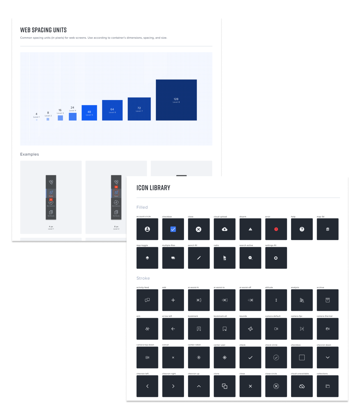
This section is split into 5 subsections: Typography, Colors, Grids, Spacing, and Icons.

3. Mobile Components
All components for Shield’s external Android application, Controller. An atomic design system is applied to build up the different components and templates.
4. Web Components
All components for Shield’s internal web application, Vision. An atomic design system is applied to build up the different components and templates.
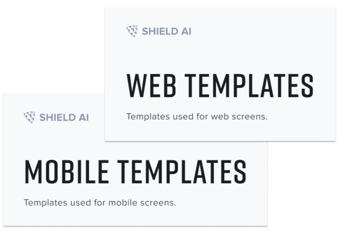
5. Templates
Includes both Web and Mobile templates for various sections.

6. Archived
All previous designs that are no longer in use. Kept for recording purposes.
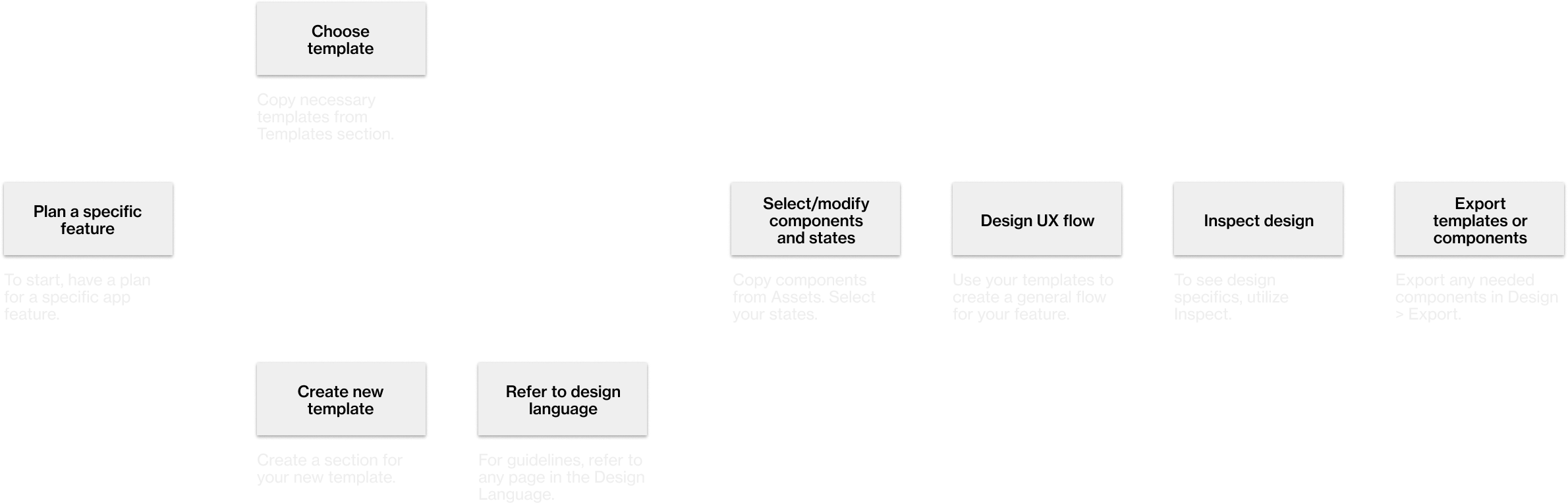
How to Use
Overall, the system exists on Figma. Along with a basic knowledge of the software, there are multiple cases of usage for the design system, which includes:
Referencing the design language for new templates or components
Designing a features with templates
Selecting and modifying components and icons in Assets
Inspecting design specifics
Exporting existing components or icons
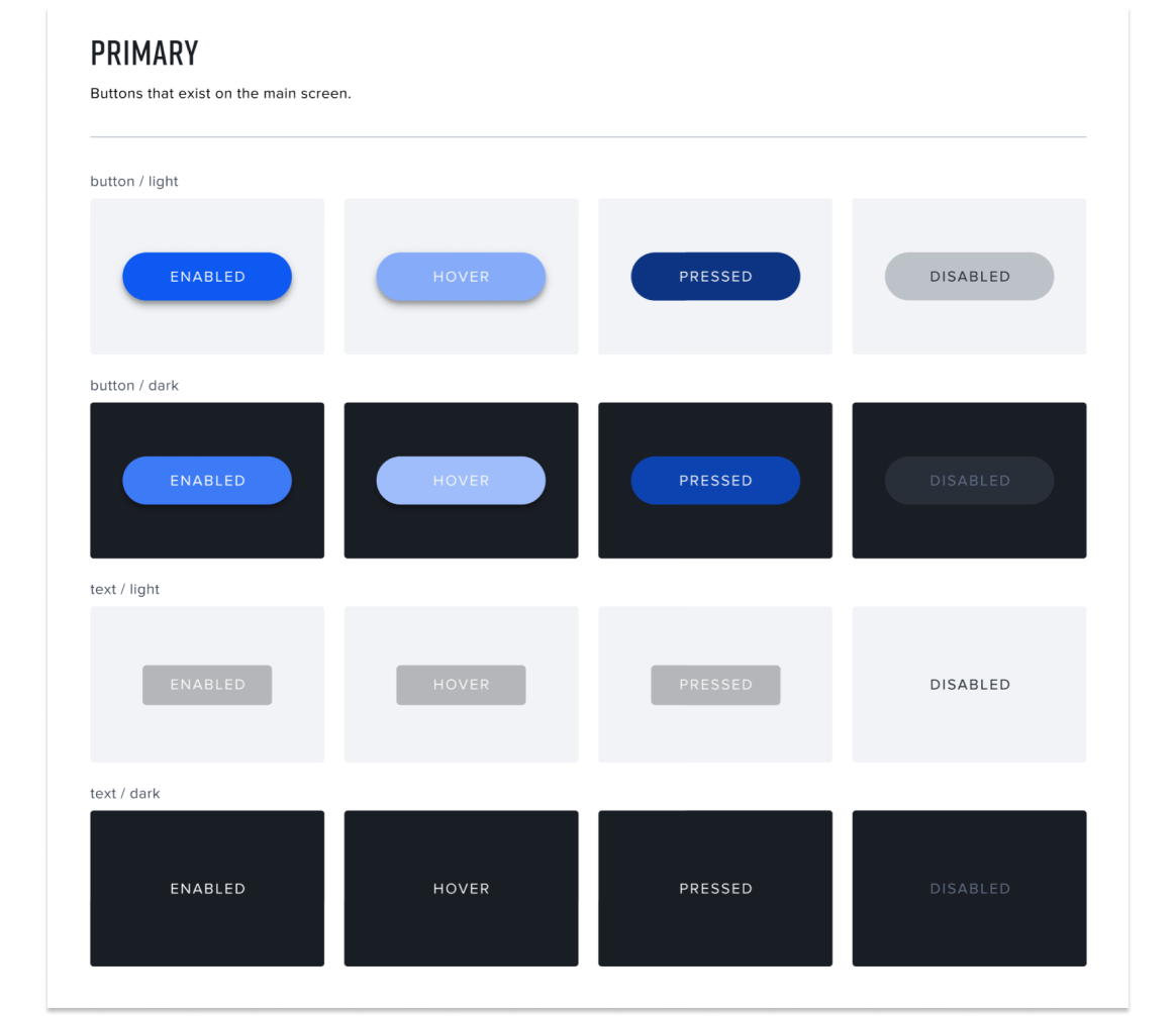
Styles
The library contains 4 main styles: Text Styles, Color Styles, Effect Styles, and Grid Styles.
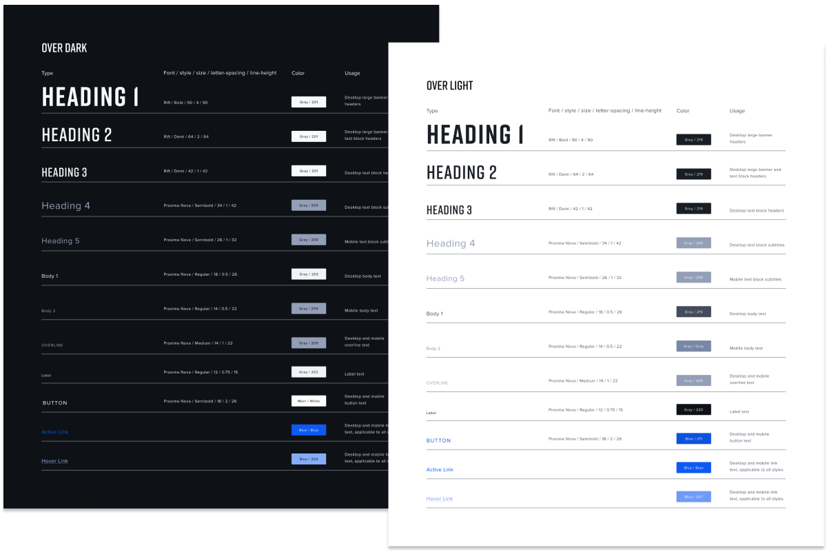
Text Styles
Typography is defined by Text Styles. When using typography, the designer or developer can select the correct Style and apply the corresponding Color Style to it, depending on the type and background — over dark or over light.

Color Styles
The color palette is defined by Color Styles, which is organized in different sections: Colors, General, Web and Mobile Buttons, Icons, and Typography.
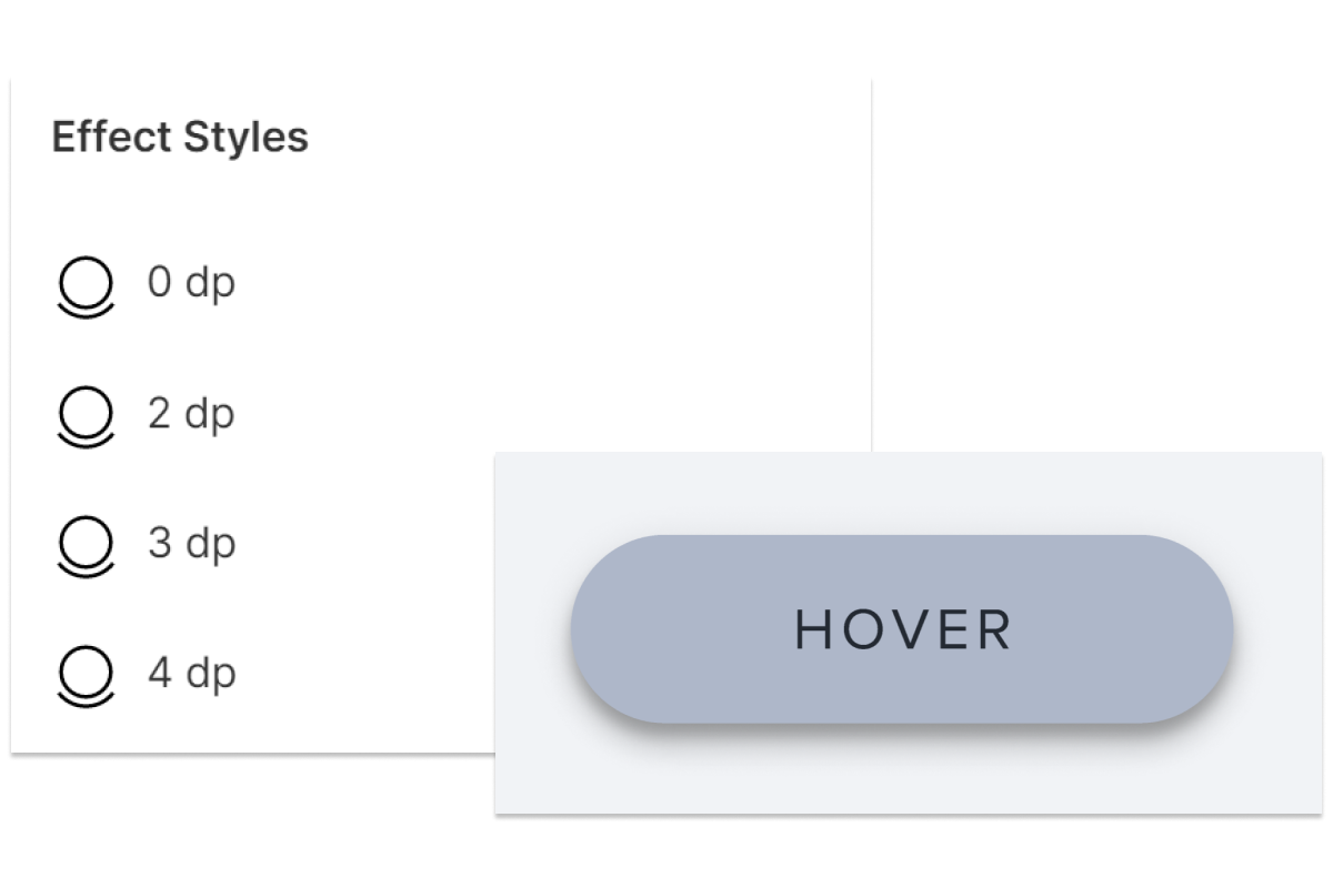
Effect Styles
Shadows are defined by Effect Styles, and range from 0 dp to 12 dp.

Grid Styles
Grid Styles can be applied to components and templates for responsive layouts. For screens, there are grids that range from small to extra large. For smaller components, there are corresponding grids that can be applied.
My project contains some confidential company information that cannot be displayed publicly.
But still want to see the process and my side projects?
Please email me at jentran@berkeley.edu to read more!
Reflection
Design is a multidisciplinary, nonlinear process.
At Shield AI, the design and development teams essentially work together as one team. Cross-team collaboration is embedded throughout the design process, and designer-developer handoff isn’t as simple as the UX designer sending interfaces for the developers to implement. Throughout the summer, I constantly communicated with my extended “team” via brainstorming sessions, receiving and giving opinions, and collaborative iteration.
I already knew that design stems from many different disciplines, but collaborating with developers throughout the summer taught me how integrated design is with other disciplines and teams.
Iterate, iterate, iterate.
The design process is never truly over. After completing the foundation of the Shield Design System, I continued to tweak and implement changes whenever I received feedback from designers and engineers, added in new components or sections, or realized more streamlined implementations. At the end of my internship, after my final presentation, I still felt that I could continue the iteration process to improve the design system. Being open to continued iteration even after I established the design system’s format allowed me to create new and improved implementations.
Project ownership is both scary and exciting.
During the time of my internship, the design team at Shield AI consisted of three people: UX Design Head and manager Irene, UX Design Lead Nick, and the UX Design intern — me. Due to how small the design team was, Nick and Irene were bombarded with their own work, leaving me to take complete ownership of my project.
It was scary being responsible for such an important and foundational component of the company, but it was a great learning experience for me. I gained so much confidence in my capabilities throughout the summer by scheduling and leading meetings for my project, conducting my own research, and making my own decisions for what the design system should look like. It was extremely validating to hear positive feedback from the design team and other engineering teams on my work, but despite that, I was able to blossom as a designer by leading my own project and side projects. Overall, it was a invaluable experience, and although it was initially intimidating to be in charge of the design system, I’m happy that I was able to conquer the problem and create a solution on my own accord!
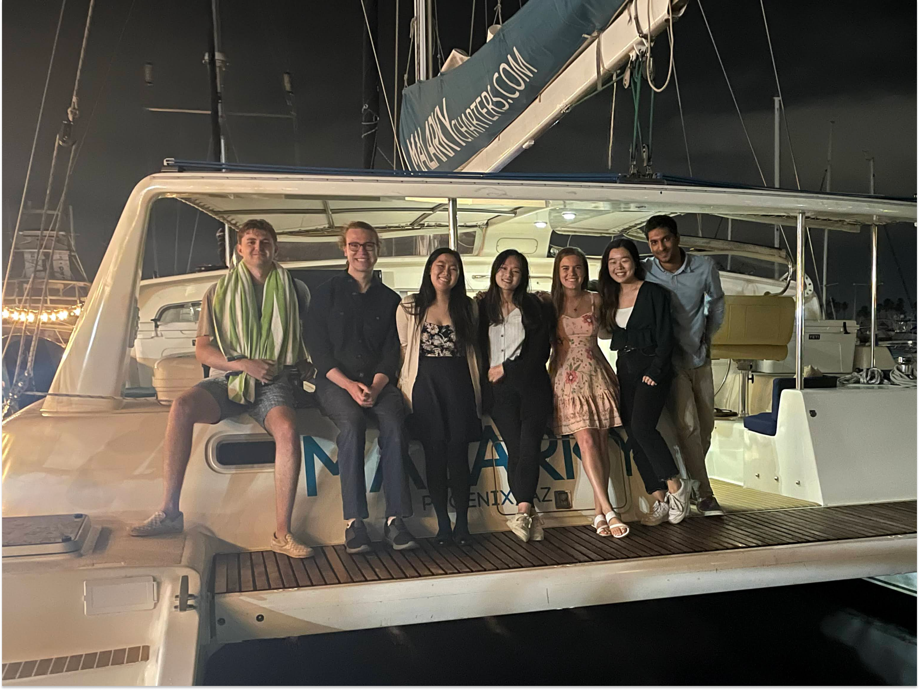
The interns celebrating the end of our summer with a boat party!
Thanks so much to everyone at Shield AI!
I met and got to know so many amazing people this summer, and I’m so grateful to have interned at such a fast-paced yet friendly company. I learned so much and gained a lot of confidence in my design skills and abilities, all while exploring the sunny city of San Diego.
I would also like to thank Irene and Nick for being amazing team members and managers! I truly felt like I was part of the team, and that my work was impactful and valued. It was very inspiring and valuable to work with such a great duo of designers. :)